Art Tutorials & Skills • 6 min read
Color Theory 101: How to Choose Harmonious Palettes for Any Coloring Sheet
August 18, 2026
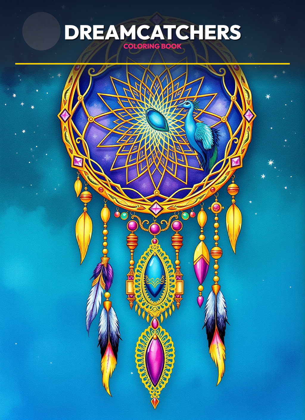
Have you ever started a coloring page with excitement, only to find the finished page looks chaotic or muddy? The secret to striking artwork lies in basic color theory. Understanding how colors interact empowers you to craft intentional moods and balanced compositions.
The 3 Essential Color Harmonies
- Analogous Colors: Neighboring colors on the color wheel (e.g., Teal, Blue, and Violet) create peaceful, unified compositions.
- Complementary Colors: Opposite colors (e.g., Blue and Orange, Purple and Yellow) create dynamic, high-impact contrast.
- Triadic Schemes: Three evenly spaced colors (e.g., Red, Yellow, Blue) deliver vibrant, playful energy.
The 60-30-10 Rule
Use your dominant color for 60% of the page, a secondary coordinating color for 30%, and a bright accent pop for the remaining 10% of fine details.